Sooner or later, boards ask that question about cyber risk and too often the answer is a color. Every organization with a cybersecurity program documents its controls, maintains a risk register, and presents heat maps to the board. But a heat map that looks authoritative on the slide, green shading into amber into red, is not an answer to a question asked in francs.
Many other fields have long since developed quantified answers to questions of this kind. Finance measures value at risk, healthcare runs clinical trials, aerospace performs failure mode analysis. Cybersecurity, despite now having more data and more tooling than ever, still communicates risk primarily through an ordinal color scale. This article looks at how that can change: which methods are available, where the numbers come from, and how to make a realistic start.
Why Heat Maps Struggle with the Question
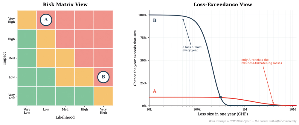
Consider two risks that sit on almost every organization’s register. The first is a ransomware attack: rare, perhaps once in many years, but devastating when it hits – production stops, systems are encrypted, recovery can drag on for weeks, and the bill can reach tens of millions of francs. The second is a contained incident: a data leak from a file sent to the wrong recipient, a shared folder left open for an afternoon. It happens far more often, but the damage is usually limited.
On a standard heat map both come out «High», but for very different reasons: the rare, catastrophic one because its impact is extreme; the frequent, contained one because it happens more often. They share the same color and the same priority, and the color hides the difference: a rare-but-catastrophic risk and a frequent-but-moderate one can share a color and still behave nothing alike from one year to the next.¹
The labels have the same weakness. When you ask multiple people what a «Medium» likelihood mean – one chance in three? one in five? one in ten? – you will most likely get different answers. «Medium» feels like shared information, but each person is filling in their own number; a word on a color scale carries no stable, agreed meaning.² So when a risk owner writes «Medium» and the board reads «Medium,» there is no guarantee they understand the same thing.
First, Scope the Risk
Before quantification can begin, there is a more fundamental question that needs answering: what counts as a risk?
A properly scoped risk has four elemen:ts a threat (who or what acts), an asset (what is at stake), an effect (what happens), and a timeframe (over what period).
Measured against this definition, «cloud» is not a risk, «insider threat» is a threat community, and «weak passwords» is a deficient control. The timeframe is part of the definition; most analyses use twelve months, which lines up with budget cycles and board reporting. In practice, this test eliminates many entries on a typical register and the scoping exercise alone is often worth the effort, before any quantification is involved.
The Method: Decompose, Estimate in Ranges, Simulate
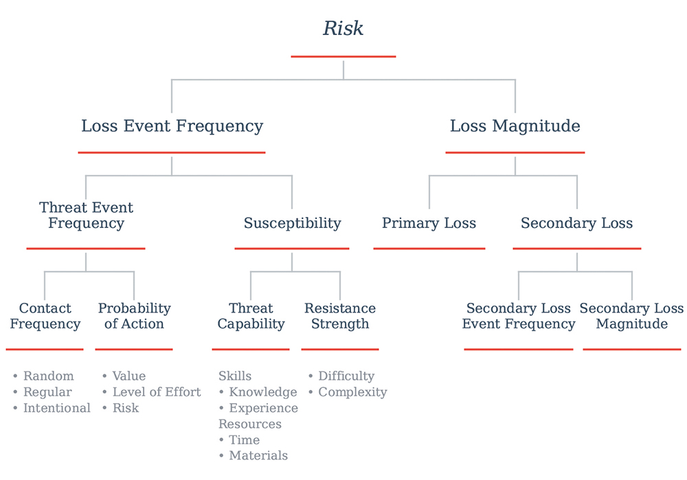
FAIR (Factor Analysis of Information Risk) has established itself as the de facto standard for Cyber Risk Quantification (CRQ)³. Its core principle: decompose risk into components that can be estimated individually, even with imperfect data.
A quantified analysis of this kind produces a forecast. It is tempting to read a risk figure as a snapshot of where things stand today, a reading on a gauge, a mark on a scale. But the questions it answers are forward-looking: over the coming year (twelve months is the usual horizon), how often is a loss event likely to happen (loss event frequency), and how much is it likely to cost when it does (loss magnitude)? Frequency decomposes further into how often a threat actor attempts an attack and what fraction of attempts succeed – where control effectiveness and an organization’s security posture enter the model. Magnitude splits into primary loss (the direct impact) and secondary loss (fines, lawsuits, reputation damage, costs that arrive with a delay).
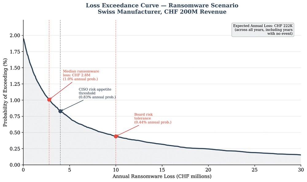
Each factor is estimated as a range rather than a single point estimate: we can never say with absolute certainty that «the loss will be CHF 512,450» but we can say it would be «between CHF 200,000 and CHF 1.2 million, with 80% confidence.» A Monte Carlo simulation then runs the scenario thousands of times, drawing from those ranges on each pass, and produces a loss exceedance curve – a chart showing the probability of exceeding any given loss over a year. This distribution is, in effect, a forecast: not a prediction of next year’s single loss, but the full range of what the year could hold and how likely each outcome is. Various risk appetite statements can be read directly off the curve.
Fig.1 Left: a heat map of two «High» scenarios»; Right: the loss-exceedance view shows two risks with the same average annual cost but very different curves – risk B causes a small loss almost every year, while only risk A reaches business-threatening losses. (Quelle: ISACA)
Where the Numbers Come From
This is usually the first question skeptics ask, and it has a concrete answer: three sources, used together, starting with what is already available.
1. Calibrated experts’ estimates. Structured expert estimation provides a minimum, most likely, and maximum for each factor, from the practitioners who know the environment. Estimation of this kind is a learnable skill: the feedback that makes weather forecasters well-calibrated – a 70% chance of rain, and it rains about 70% of the time⁴ – works the same way for risk analysts.⁵ A wide range honestly stated as «somewhere between one and ten times a year», already contains more information than a color.
2. Published data. Freely available sources cover every FAIR factor. For example, for loss magnitude, Cyentia’s IRIS study, built on a corpus of over 150,000 real loss events, provides loss distributions by sector and revenue band⁶, and NetDiligence publishes claims with cost breakdowns including forensics, legal, notification, business interruption costs⁷. For frequency, the Verizon DBIR provides incident patterns and threat actor mixes⁸, while insurer reports (Coalition, Sophos) give prevalence by sector, size, and country. GDPR trackers and FINMA reporting catalogue fines by jurisdiction and sector – relevant to Swiss companies processing EU data. MITRE ATT&CK Evaluations and CIS benchmarks provide empirical detection and prevention rates by control type. Not all data is equal, and a short quality check is worthwhile before a source enters the model: Is the methodology described? What type of measurement is it: telemetry, survey, claims, public record? Does the publisher benefit from alarming numbers?
3. Internal telemetry. The existing security stack already produces signals and metrics that can be mapped to FAIR, but it typically requires work to translate them. EDR alerts measure what gets blocked and what gets through. Vulnerability scans and time-to-patch produce inputs that map to susceptibility. Pentest results show whether an attacker can get through, and incident history feeds loss magnitude. A useful guideline: telemetry should update the estimate, not replace it.
The three layers work together, each narrowing the range. Expert judgment alone might say «CHF 100,000 to 50 million.» Anchored against sector loss data, the range narrows to perhaps «CHF 400,000 to 5 million.» A year of telemetry tightens it further, with every input documented.
None of this removes the forecasting problem. All of this data describes the past. Every breach record, every log, every industry figure represents past events and the future does not always resemble it: a control is added or retired, a workload moves to the cloud, and the conditions that produced the data no longer hold. Data tells you what has happened; it cannot choose your time horizon, decide which part of the past still applies, or judge whether last year’s conditions hold. This is where subject matter experts’ estimates and judgment come in.
Fig. 3 FAIR - Factor Analysis of Information Risk (Quelle: ISACA)
What Changes: A Concrete Example
The example below is drawn from a real decision, deliberately simplified with rounded figures, the model compressed to its essentials, to show how the conversation changes.
A large Swiss manufacturer was weighing two-factor authentication for a customer-facing portal with millions of users in an account-takeover scenario. 2FA was largely implemented but switched off over user-friction concerns. The qualitative assessment rated it Likelihood: Medium, Impact: High (an orange cell) and it had competed unsuccessfully against other «High» risks for years, with no analytical basis for prioritization.
A quantitative analysis put the same decision in a different light. Without 2FA, the probability of a successful account-takeover attack over the year was estimated at 80–90%, corresponding to an annualized loss exposure of roughly CHF 7 million. With 2FA the estimated success probability fell to 20–40% and the exposure to about CHF 2.5 million. Set against the CHF 200,000 cost, that CHF 4.5 million reduction in expected loss is a benefit-cost ratio of roughly 22 to 1, which makes the decision no longer a matter of opinion.
A result like this changes the nature of the conversation and the discussion shifts from rating disagreements to documented assumptions backed by evidence. The change is transparency rather than precision. It also shifts the question from a single number for today toward how a decision changes what lies ahead: if we invest, how do we expect the probable frequency and magnitude of loss over the next year to move? Executives are used to this. They make forecasted bets on revenue and capital every quarter, and a cyber-risk forecast is one more of the same kind, often better received when it is honest about its limits. Setting it beside the revenue forecast they already rely on is a quick way to frame what it is.
Loss exceedance curve — fictitious example of a ransomware scenario for a CHF 200 million-revenue Swiss manufacturer. Each point answers «what is the probability of losing more than X this year?» visualized against the risk appetite and control investment. (Quelle: ISACA)
How to Start Without Drowning
In Gartner’s 2024 survey of 155 security and risk leaders, only 20% of self-described CRQ adopters had reached statistical modeling – the majority still relied on ordinal or point-estimate scales rather than probability distributions.⁹ The common causes of disappointment are overscoping (quantifying everything at once), purchasing tools before building the underlying methodology, false precision that erodes credibility, and keeping results within the security silo. Successful implementation is nonetheless achievable and the timeline below shows how programs can reach 80% coverage in two years, starting with minimal resources.
A realistic first year:- Months 1–3: Train a small team, scope 5 scenarios, pilot one business unit.
- Months 4–6: First board report.
- Months 7–12: Operationalize. Quarterly cadence; control ROI for investment decisions.
- Year 2+: Real-time data, continuous intelligence; operational data flowing through the CRQ model in near real-time.
For Swiss organizations, regulation points the same way. The Information Security Act (ISG) and FINMA’s operational-risk expectations both call for risk management that is demonstrably proportionate – and proportionality is considerably easier to demonstrate with a loss exceedance curve than with a matrix. Companies operating in the EU additionally face NIS2 and, for financial entities, DORA’s scenario-based impact assessments, which map directly to CRQ output. Cyber insurers, too, increasingly ask for quantitative risk data at renewal.
A realistic first step has three parts. Pick the most visible risk and scope it properly: threat, asset, effect, timeframe. Estimate three ranges (frequency of attack, susceptibility to attack, potential losses) drawing on internal expertise first, published anchors second, telemetry third. Then present the result to the person who owns the budget. Write the assumptions down, too – that a control keeps performing as it has, that threat activity stays roughly where it is, that the environment does not change materially over the period. Written down, they can be challenged, which is how an analysis improves; and when reality diverges from the forecast, a broken assumption is usually where to look.
None of this makes the number true but it does make it honest, documented, and open to challenge, which is more than a color can offer. The goal is not certainty about next year, but a forecast, in francs, that the business can question, act on, and revisit as conditions change.
Footnotes
1. Cox, L.A., «What’s Wrong with Risk Matrices?», Risk Analysis 28(2), 2008.
2. Mauboussin, A. & Mauboussin, M., «If You Say Something Is ‹Likely,› How Likely Do People Think It Is?», Harvard Business Review, 2018; Kent, S., «Words of Estimative Probability», CIA, 1964.
3. Open FAIR™ standard, The Open Group; Jones, J. & Freund, J., Measuring and Managing Information Risk, 2014.
4. Murphy, A.H. & Winkler, R.L., «Reliability of Subjective Probability Forecasts», Journal of Applied Meteorology, 1977.
5. Hubbard, D., How to Measure Anything, 3rd ed., Wiley, 2014.
6. Cyentia Institute, Information Risk Insights Study (IRIS) 2025, cyentia.com
7. NetDiligence, Cyber Claims Study, annual, netdiligence.com.
8. Verizon, Data Breach Investigations Report, annual, verizon.com/dbir.
9. Gartner, Cyber-Risk Quantification Survey, 2024
Die Autorin
Laura Voicu ist Co-Founder & Chief Data Science Officer, Enterprise Risk Quantification Institute; Standards Committee Member, FAIR Institute.